Visualizing Spatial Data in R: Additional Examples
Overview
In this short module, I will provide an introduction to another mapping package: mapsf. This package builds upon a prior package called cartography, which is no longer being updated. I prefer to work with tmap; however, the mapsf package can be useful if you want to be able to produce a variety of thematic maps, including choropleth, proportional symbol, and graduate symbol maps. We will also work with data from Eurostat, which provides statistical information for European Union (EU) countries and other geographic aggregating units. These data can be accessed in R using the eurostate package. The link at the bottom of the page provides the example data and R Markdown file used to generate this module.
In this first code block I am reading in the required packages.
library(eurostat)
library(mapsf)
library(ggplot2)
library(dplyr)
library(RColorBrewer)
library(viridis)
library(sf)
Fetch Data
I would like to find data associated with renewable energy use in EU countries. The search_eurostat() function from the eurostate package allows you to search for data using keywords. Here, I am searching for data related to “renewable energy”. I am also specifying that I want data in a table format. I then print the results of the query.
query <- search_eurostat("renewable energy", type="table")
query$title
[1] "Share of renewable energy in gross final energy consumption"
[2] "Share of renewable energy in gross final energy consumption by sector"
[3] "Share of renewable energy in gross final energy consumption"
[4] "Share of renewable energy in gross final energy consumption"
[5] "Share of renewable energy in gross final energy consumption by sector"
[6] "Share of renewable energy in gross final energy consumption by sector"
query$code
[1] "t2020_31"    "sdg_07_40"   "t2020_31"    "t2020_rd330" "sdg_07_40"
[6] "sdg_07_40"
I would like to access the data in the first table. This can be accomplished using the get_eurostat() function. I access the table using its unique ID. I also indicate that I want labels to be generated for each column as opposed to using the original codes so that these data are more easily interpreted. I also indicate that I want these data aggregated by year.
I use the glimpse() function to inspect the data. This is similar to summary(); however, it is generally used on tibbles within the tidyverse. The data contains five columns.
- unit: unit of measurement (percentages)
- indic_eu: what is being measured (percent renewable energy use)
- geo: the geographic units (countries)
- time: time period (year)
- values: the actual measures (Percent of energy consumption from renewable energy by country)
re_en <- get_eurostat(id="t2020_31", time_fomat="date", type="label", select_time="Y")
glimpse(re_en)
Rows: 623
Columns: 5
$ unit     <chr> "Percentage", "Percentage", "Percentage", "Percentage", "Perc~
$ indic_eu <chr> "Share of renewables", "Share of renewables", "Share of renew~
$ geo      <chr> "Albania", "Austria", "Bosnia and Herzegovina", "Belgium", "B~
$ time     <date> 2004-01-01, 2004-01-01, 2004-01-01, 2004-01-01, 2004-01-01, ~
$ values   <dbl> 29.621, 22.554, 20.274, 1.890, 9.231, 3.071, 6.774, 6.207, 14~
Next, I generate a new column and extract just the year from the time attribute. This is accomplished by reformatting the date information. For example, I converted a date from 2017-01-01 to just 2017.
re_en$year <- format(as.Date(re_en$time, format="%Y-%m-%d"),"%Y")Graph Data
Before I map the data, I will explore it using ggplot2. In the next code block, I am creating a box plot to show the distribution of renewable energy per year. I am also using the viridis package to define a color palette. Since we have already discussed ggplot2, I will not spend time here discussing the specifics. You should be familiar with the syntax. Feel free to manipulate the code to alter the figure.
The graph suggests a slight rise in renewable energy use over time when aggregated at the country-level. Also, there appears to be a lot of variability in renewable energy use between countries.
ggplot(re_en, aes(x=as.factor(year), y=values, fill=year))+
geom_boxplot(color= "#302f2d")+
ggtitle("Percent Renewable Energy by Year")+
labs(x="Year", y="Percent")+
scale_y_continuous(expand= c(0,0), breaks = c(10, 20, 30, 40, 50, 60, 70, 80), labels = c("10%", "20%", "30%", "40%", "50%", "60%", "70%", "80%"), limits = c(0, 80))+
scale_fill_viridis(discrete=TRUE)+
theme_classic()+
theme(legend.position="None")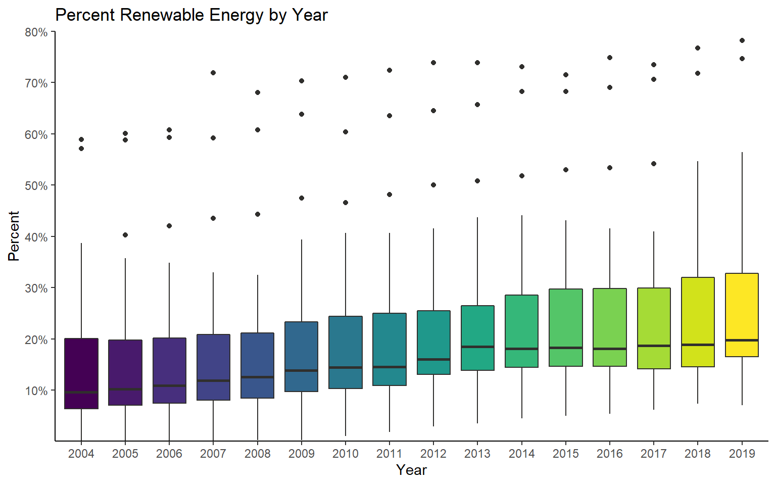
Let’s explore the trend for a single country. First, I use dplyr to extract all records for Hungary.
hungary_data <- re_en %>% filter(geo=="Hungary")Next, I create a time series graph with lines and points to visualize the trend. This suggests a steady increase until 2015 followed by a decrease.
ggplot(hungary_data, aes(x=as.numeric(year), y=values))+
geom_line(color="#13502d", size=1)+
geom_point(color="#13502d", size=2.5)+
ggtitle("Percent Renewable Energy")+
labs(x="Year", y="Percent")+
scale_y_continuous(expand= c(0,0), breaks = c(4, 6, 8, 10, 12, 14, 16, 18), labels = c("4%", "6%", "8%", "10%", "12%", "14%", "16%", "18%"), limits = c(4, 18))+
scale_x_continuous(expand= c(.015,.015), breaks = c(2004, 2006, 2008, 2010, 2012, 2014, 2016, 2018), labels = c("2004", "2006", "2008", "2010", "2012", "2014", "2016", "2018"), limits = c(2003, 2018))+
theme_classic()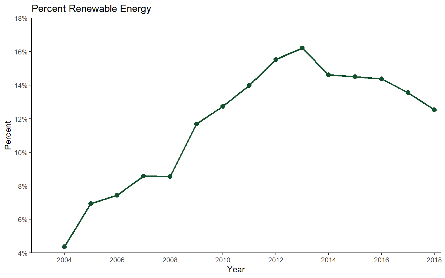
Let’s now compare multiple countries. First, I use dplyr to extract records associated with Hungary, France, or Finland.
sub_data <- re_en %>% filter(geo=="Hungary" | geo == "France" | geo == "Finland")Graphing the data, we can see very similar trends and percentages for France and Hungary while Finland has a larger percentage of renewable energy use.
ggplot(sub_data, aes(x=as.numeric(year), y=values, color=geo))+
geom_line(size=1)+
geom_point(size=2.5)+
ggtitle("Percent Renewable Energy")+
labs(x="Year", y="Percent", color="Country")+
scale_y_continuous(expand= c(0,0), breaks = c(5, 10, 15, 20, 25, 30, 35, 40, 45, 50), labels = c("5%", "10%", "15%", "20%", "25%", "30%", "35%", "40%", "45%", "50%"), limits = c(0, 50))+
scale_x_continuous(expand= c(.015,.015), breaks = c(2004, 2006, 2008, 2010, 2012, 2014, 2016, 2018), labels = c("2004", "2006", "2008", "2010", "2012", "2014", "2016", "2018"), limits = c(2003, 2018))+
theme_classic()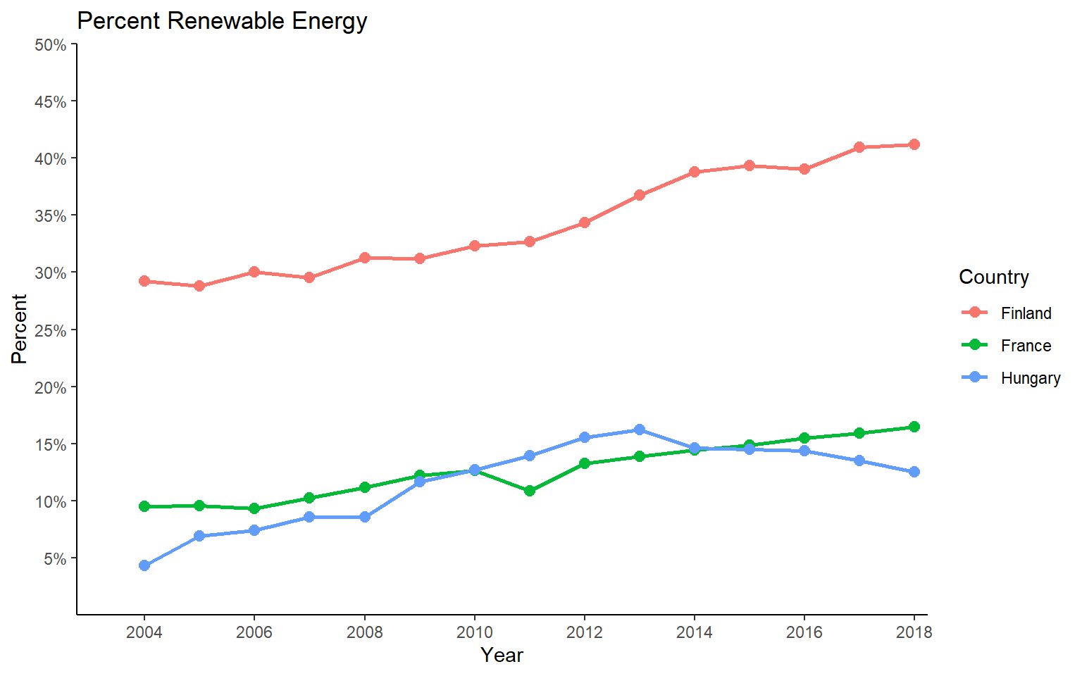
Map Data
I will now move on to explore the data using maps. I will demonstrate the mapsf package. However, similar visualizations can be created using tmap.
I first need to prepare the data for use in map space. Here is the process.
- Use the get_eurostate_geospatial() function to obtain the geographic data. Here, I am indicating that I want to return an sf object, that I want boundaries as of 2016, and that I want country boundaries (NUTS classification (Nomenclature of Territorial Units for Statistics) Level 0). The resolution argument is used to specify the desired simplification of the boundaries.
- I then write the country codes to a new data frame. These codes are made available in the eurostate package as eu_countries.
- I convert the codes to factors and store them in a new field called “geo”.
- I use dplyr and the left_join() function to join the codes to the renewable energy data using the common “geo” field.
- I filter out just data for 2015.
- In the geographic data, I create a new field called “code” in which to copy the “CNTR_CODE” data. This is so that I have a common field name on which to join the tabulated and spatial data.
- I join the geographic data and tabulated data for 2015 using the common “code” field.
- Lastly, I remove any records that have missing data in the values field.
The data are now ready to be mapped.
euro_sf <- get_eurostat_geospatial(output_class = "sf", nuts_level = "0", year="2016")
c_codes <- eu_countries
c_codes$geo <- as.factor(c_codes$label)
c_data <- left_join(c_codes, re_en, by="geo")
c_data_2015 <- c_data %>% filter(year==2015)
euro_sf$code <- euro_sf$CNTR_CODE
map_data <- left_join(euro_sf, c_data_2015, by="code")
map_data2 <- map_data %>% filter(!is.na(values))
Next, I use the st_crop() function from sf to extract out only geographic features that occur in a defined geographic extent as specified using latitude and longitude. This is because there are some islands in the data set that I would like to exclude from the analysis. I only want countries on the continent, British Isles, or in the Mediterranean. Next, I convert the data to a different projection (Europe Lambert Conformal Conic) with the st_transform() function from sf and the appropriate PROJ string.
map_data3 <- st_crop(map_data2, xmin=-12, xmax=50, ymin=33, ymax=73)
map_data4 <- st_transform(map_data3, crs="+proj=lcc +lat_1=43 +lat_2=62 +lat_0=30 +lon_0=10 +x_0=0 +y_0=0 +ellps=intl +units=m +no_defs")
The first map represents percent renewable energy using color, so this is a choropleth map. This is accomplished using the mf_theme() function with the type argument set to “choro”. I am using a quantile classification method with five bins and a green palette. Note that the mapsf package uses color palettes defined by the grDevices package. To list the available palettes, you can use the hcl.colors() function. Note also that mapsf provides a set or themes (here I am using “dark”). I am also specifying a title and credits using tf_layout(), a north arrow using mf_arrow(), and a scale bar using mf_scale().
mf_theme("dark")
mf_map(x=map_data4, var="values", type="choro", breaks="quantile", nbreaks= 5, pal="Greens", border="white", lwd=.5, leg_pos="topright", leg_title="Percent (%)")
mf_layout(title = "Percent Renewable Energy", credits="Data from Eurostat", arrow=FALSE, scale=FALSE)
mf_arrow("topleft")
mf_scale(pos="bottomright", size=1000)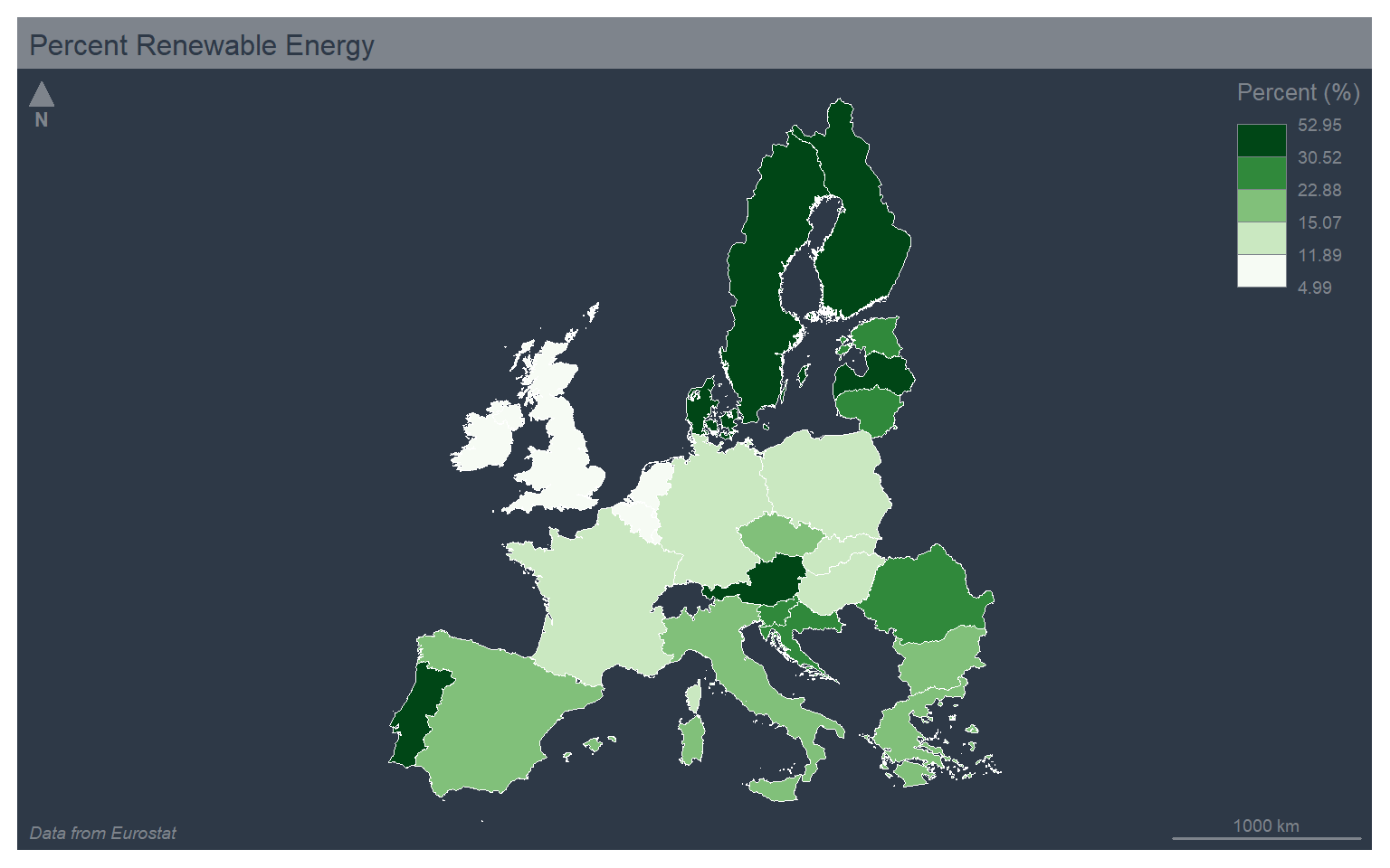
In the next example, I use the jenks, or natural breaks, classification method, which uses an algorithm to search for breaks in the data distribution to define the bins. I have also changed the theme to “green” and used the “Blues” color palette.
mf_theme("green")
mf_map(x=map_data4, var="values", type="choro", breaks="jenks", nbreaks= 5, pal="Blues", border="black", lwd=.5, leg_pos="topright", leg_title="Percent (%)")
mf_layout(title = "Percent Renewable Energy", credits="Data from Eurostat", arrow=FALSE, scale=FALSE)
mf_arrow("topleft")
mf_scale(pos="bottomright", size=1000)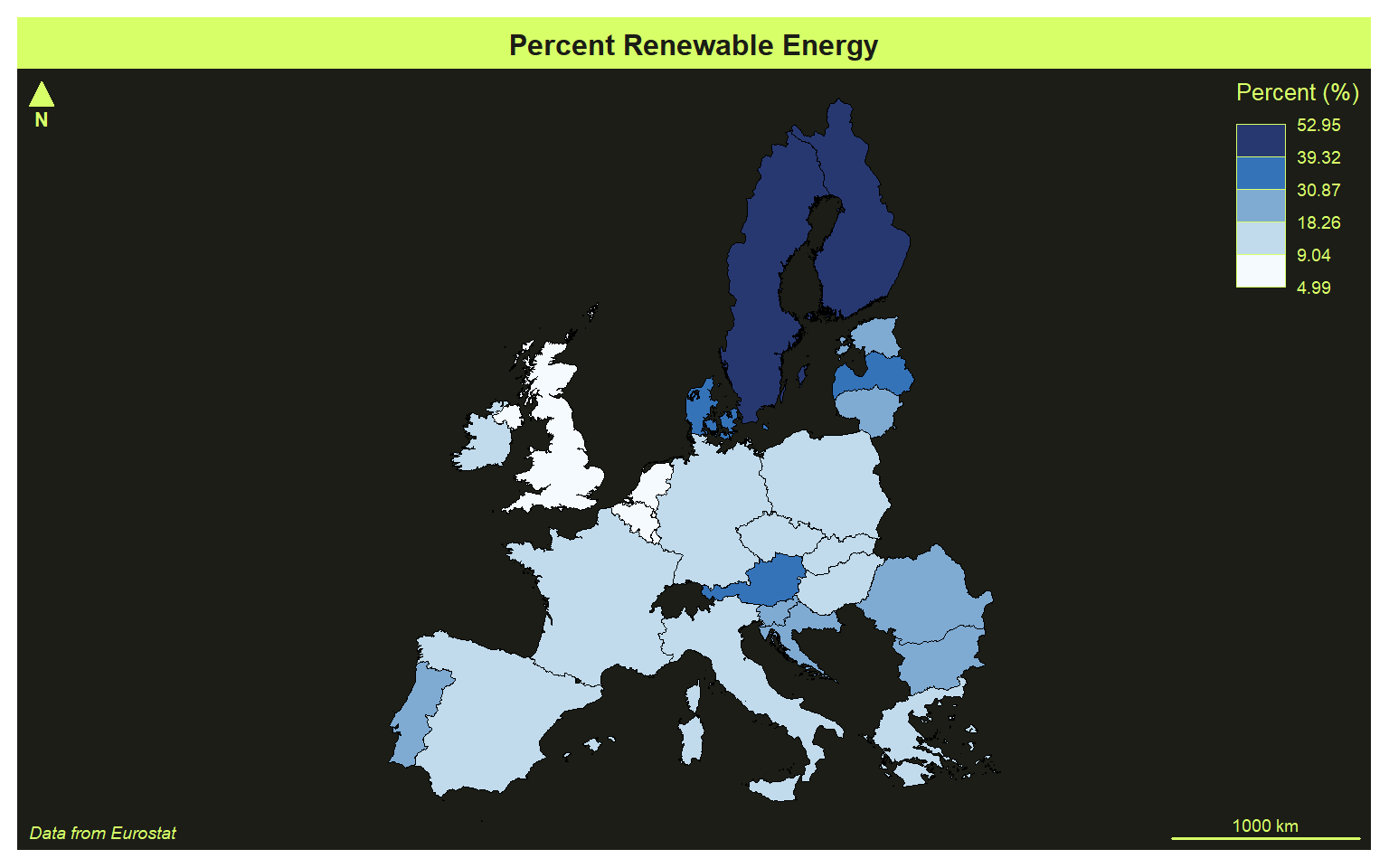
Here is an example using the equal interval classification, the “agolalight” them, and the “Grays” color palette.
The mapsf package provides many legend classification methods including: fixed, sd, equal, quantile, kmeans, hclust, bclust, fisher, jenks, dpih, q6, geom, arith, em, and msd. The different methods are described here.
mf_theme("agolalight")
mf_map(x=map_data4, var="values", type="choro", breaks="equal", nbreaks= 5, pal="Grays", border="black", lwd=.5, leg_pos="topright", leg_title="Percent (%)")
mf_layout(title = "Percent Renewable Energy", credits="Data from Eurostat", arrow=FALSE, scale=FALSE)
mf_arrow("topleft")
mf_scale(pos="bottomright", size=1000)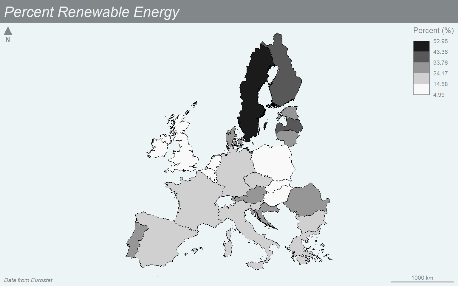
You can also define your own breaks using a manual legend classification. Here, I am using the “nevermind” theme and the “Magenta” color palette.
mf_theme("nevermind")
mf_map(x=map_data4, var="values", type="choro", breaks=c(5, 10, 20, 30, 40, 50, 60), nbreaks= 5, pal="Magenta", border="black", lwd=.5, leg_pos="topright", leg_title="Percent (%)")
mf_layout(title = "Percent Renewable Energy", credits="Data from Eurostat", arrow=FALSE, scale=FALSE)
mf_arrow("topleft")
mf_scale(pos="bottomright", size=1000)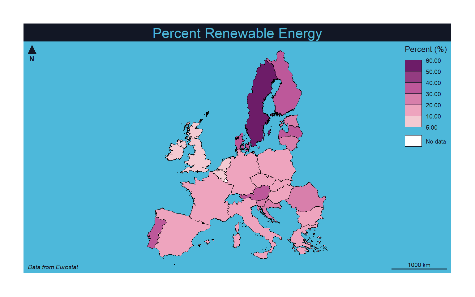
To produce a proportional symbol map where a continuous variable is mapped to the size of a symbol you can set the type to “prop”. Note that a graduated symbol method, which applies size bins as opposed to a continuous scaling, can be created by setting the type argument to “grad”. In order to have the county boundaries behind the circle symbols, I start with a map without a variable mapped to a graphical parameter and set all the counties to a color of tan. I then build the proportional symbol map on top of this base visualization.
mf_theme("dark")
mf_map(map_data4, col="tan")
mf_map(x=map_data4, var="values", type="prop", col="lightsalmon3", leg_pos="topright", leg_title="Percent (%)", leg_frame=TRUE)
mf_layout(title = "Percent Renewable Energy", credits="Data from Eurostat", arrow=FALSE, scale=FALSE)
mf_arrow("topleft")
mf_scale(pos="bottomright", size=1000)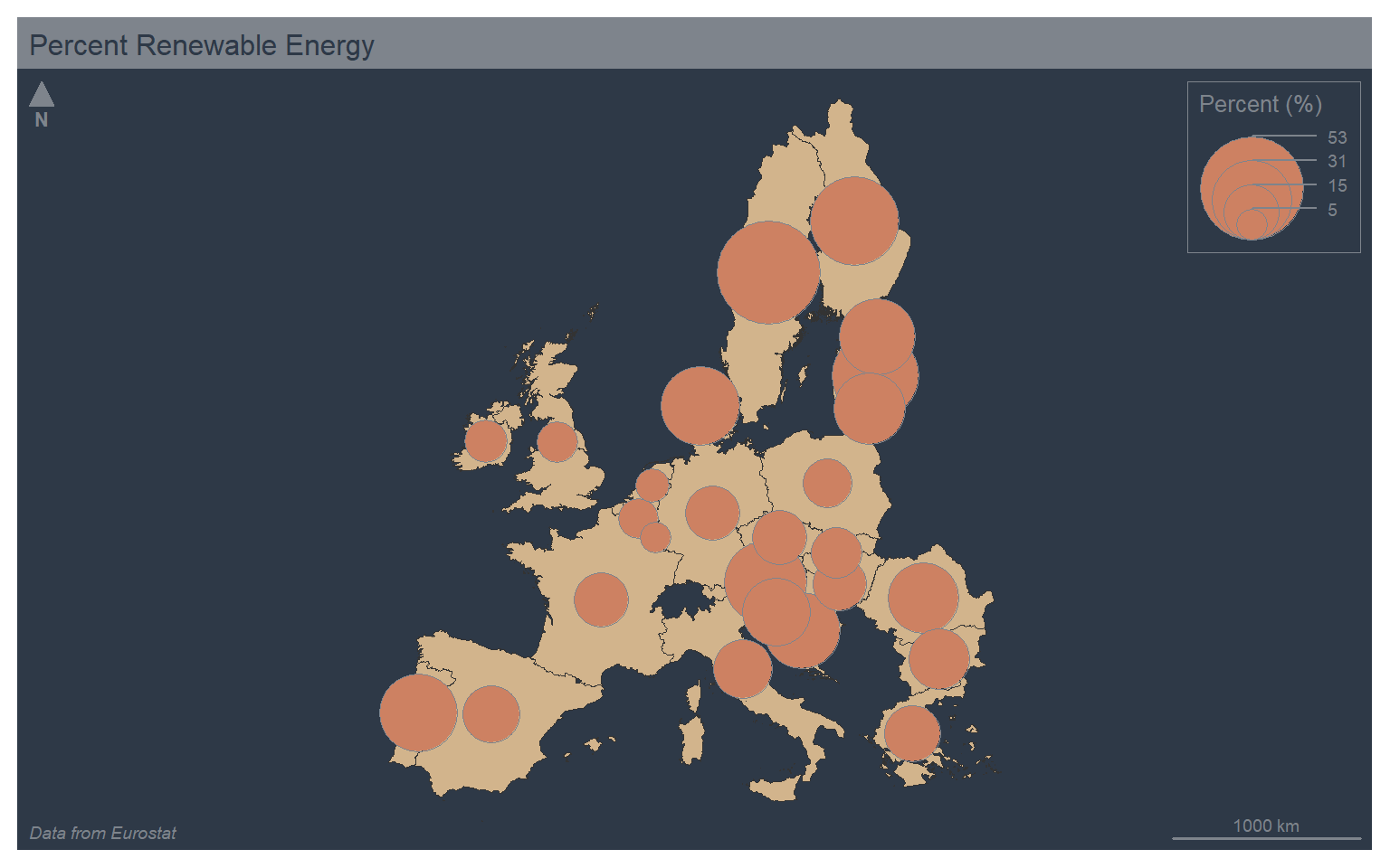
You can combine color and size symbology by setting type to “prop_choro”. This will result in two legends. In the example, I am using the mf_get_leg_pos() function from mapsf to determine optimal positions for the two legends. I also mapped the same variable, % renewable energy use, to both the size and color aesthetics. This is a bit redundant. However, I did not have another continuous variable available in the example data set.
mf_theme("dark")
mf_map(map_data4, col="tan")
mf_map(x=map_data4, var=c("values", "values"), type="prop_choro", breaks="quantile", nbreaks= 5, pal="Greens", border="white", lwd=.5, leg_pos=mf_get_leg_pos(map_data4, 2), leg_title = c("Percent (%)", "Percent (%)"))
mf_layout(title = "Percent Renewable Energy", credits="Data from Eurostat", arrow=FALSE, scale=FALSE)
mf_arrow("bottomright")
mf_scale(pos="bottomright", size=1000)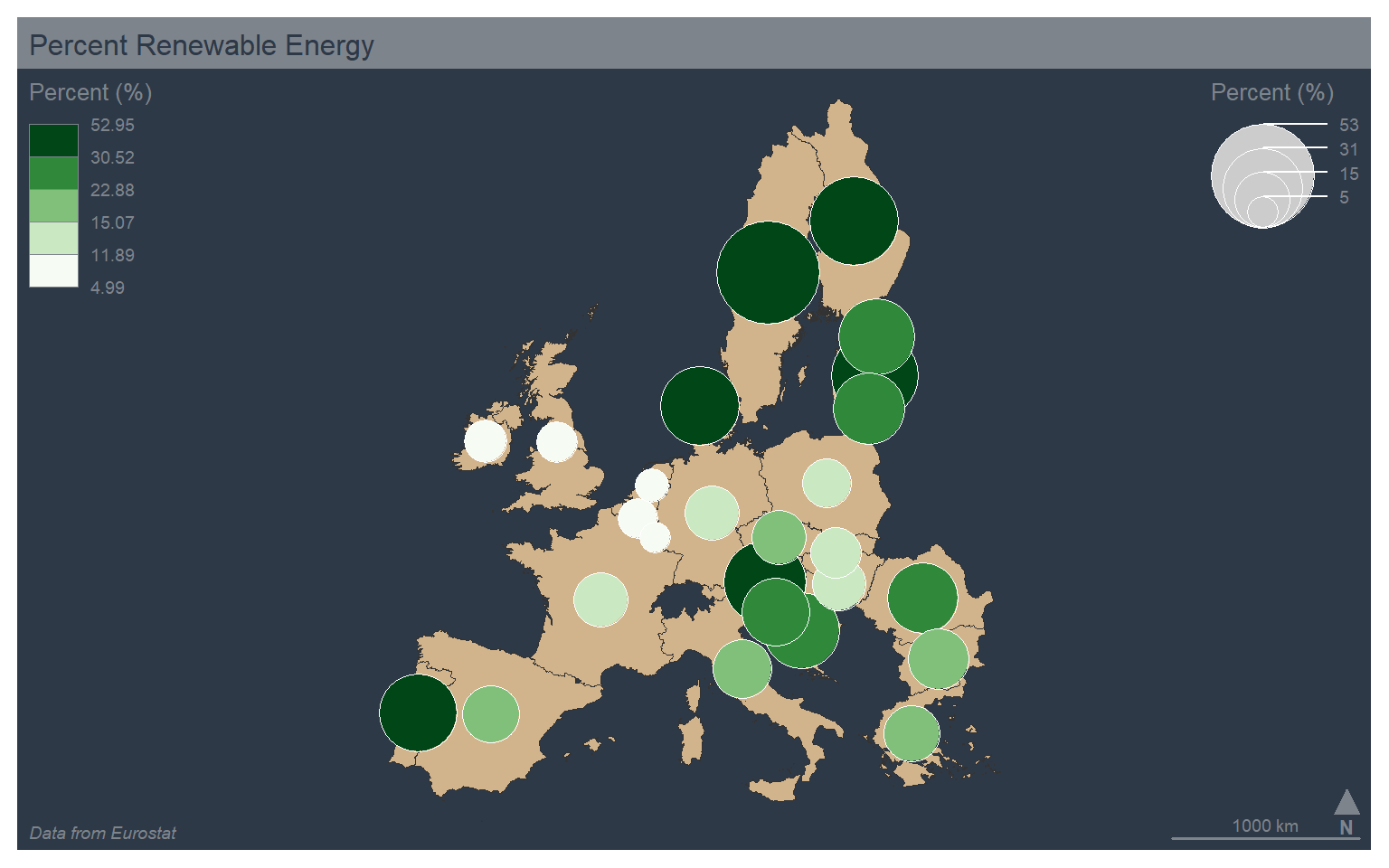
The “typo” type allows for the visualization of a categorical variable using unordered colors. In the example, I am mapping the country abbreviation to color. Note also that I set the leg_pos argument to “n”, which causes no legend to be plotted.
mf_theme("dark")
mf_map(x=map_data4, var="code", type="typo", leg_pos="n")
mf_layout(title = "Percent Renewable Energy", credits="Data from Eurostat", arrow=FALSE, scale=FALSE)
mf_arrow("topleft")
mf_scale(pos="bottomright", size=1000)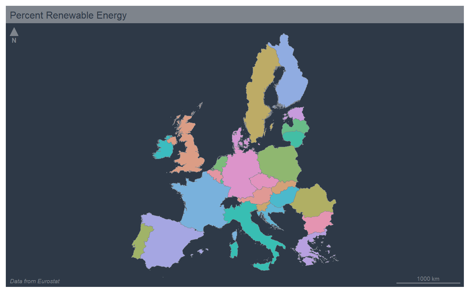
It is also possible to combine proportional symbols and qualitative colors using the “prop_typo” type. A continuous variable is mapped to size while a categorical variable is mapped to color.
mf_theme("dark")
mf_map(map_data4, col="tan")
mf_map(x=map_data4, var=c("values", "code"), type="prop_typo", pal="Greens", border="white", lwd=.5, leg_pos=c("topright", "n"), leg_title = c("Percent (%)", "Percent (%)"))
mf_layout(title = "Percent Renewable Energy", credits="Data from Eurostat", arrow=FALSE, scale=FALSE)
mf_arrow("bottomright")
mf_scale(pos="bottomright", size=1000)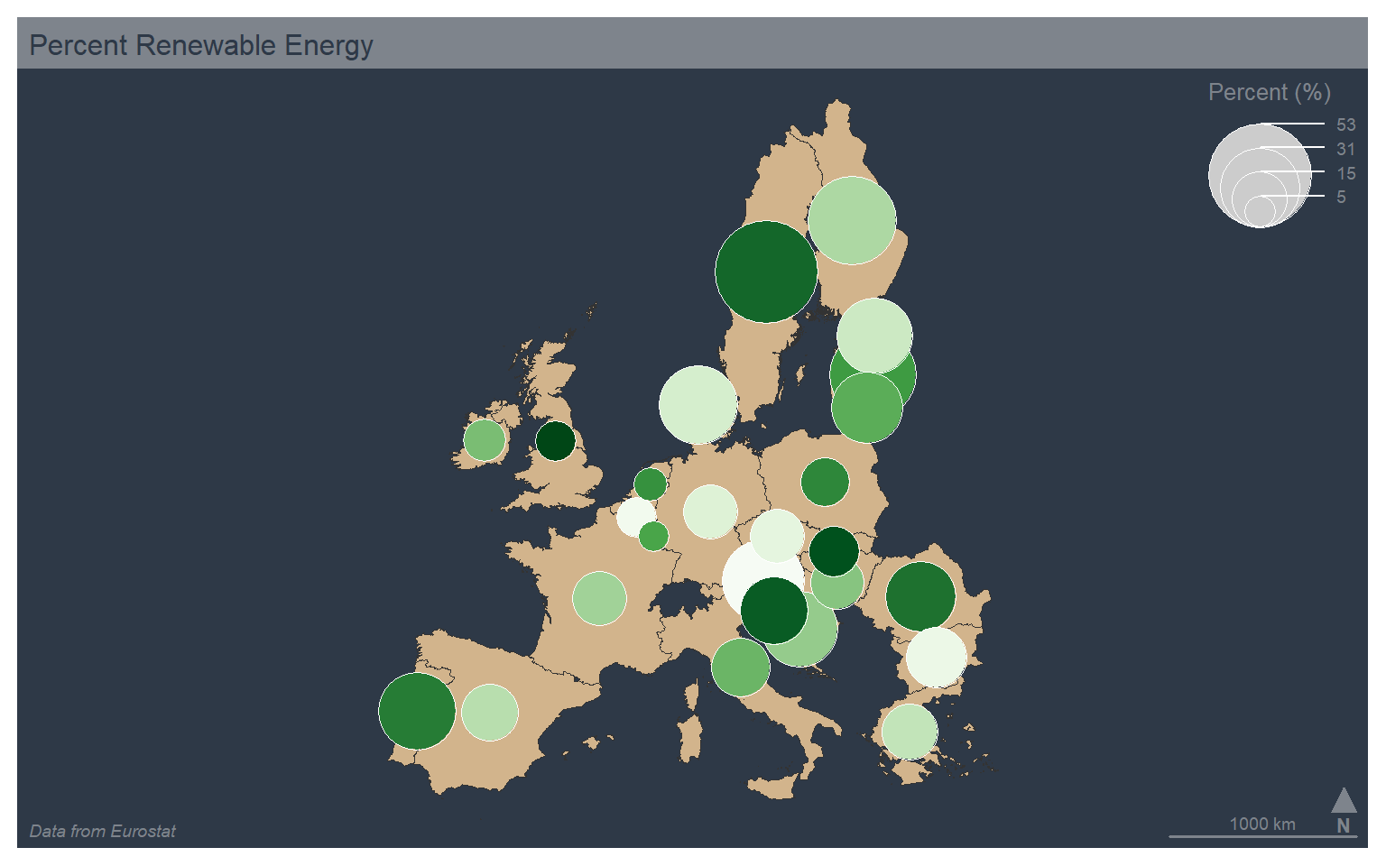
Text or labels can be added using mf_label(). Here, I add the country name as labels on top of a choropleth map of the percent renewable energy use. I add a halo, define a text size, and indicate to avoid overlapping labels. I also use the “default” theme.
mf_theme("default")
mf_map(x=map_data4, var="values", type="choro", breaks="quantile", nbreaks= 5, pal="Greens", border="white", lwd=.5, leg_pos="topright", leg_title="Percent (%)")
mf_label(x=map_data4, var="label", halo=TRUE, cex=0.5, overlap=FALSE)
mf_layout(title = "Percent Renewable Energy", credits="Data from Eurostat", arrow=FALSE, scale=FALSE)
mf_arrow("topleft")
mf_scale(pos="bottomright", size=1000)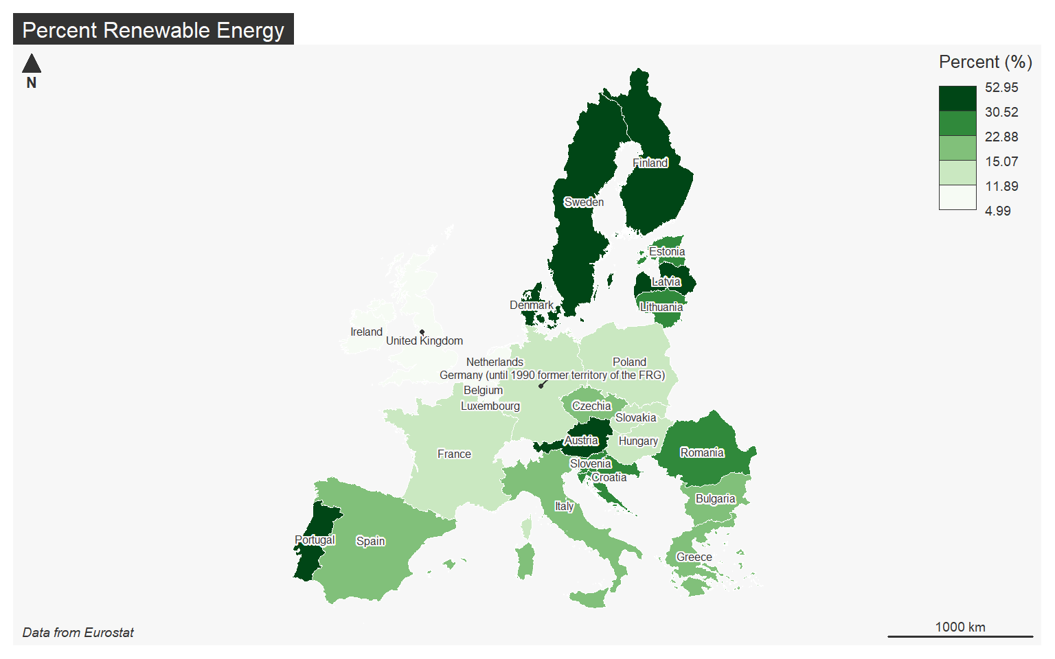
Cartograms
Continuous variables can also be visualized by rescaling the size of the geographic feature as opposed to the size of a symbol. This type of thematic map is known as a cartogram. A continuous cartogram maintains the connections between adjacent features while rescaling the feature sizes. This results in distorting feature shape. In contrast, a non-continuous cartogram rescales the size of features relative to a continuous attribute while maintaining the shape. To accomplish this, connections cannot be maintained.
In R, cartograms can be created using the cartogram package. The new geometries can be calculated by functions provided in this package (cartogram_cont() and cartogram_ncont()). The results can then be mapped using tmap. The code below demonstrates the creation of continuous and non-continuous cartograms for visualizing the relative population of counties in West Virginia.
library(cartogram)
wv_counties <- st_read("C:/Maxwell_Data/Dropbox/Teaching_WVU/WVAGP/wvagp_webgis/county_boundaries.shp")
Reading layer `county_boundaries' from data source
  `C:\Maxwell_Data\Dropbox\Teaching_WVU\WVAGP\wvagp_webgis\county_boundaries.shp'
  using driver `ESRI Shapefile'
Simple feature collection with 55 features and 27 fields
Geometry type: POLYGON
Dimension:     XY
Bounding box:  xmin: -9199945 ymin: 4467223 xmax: -8651647 ymax: 4959211
Projected CRS: WGS 84 / Pseudo-Mercator
wv_cont <- cartogram_cont(x=wv_counties, weight="POP2000")
wv_ncont <- cartogram_ncont(x=wv_counties, weight="POP2000")library(tmap)
tm_shape(wv_counties)+
tm_polygons(col="POP2000")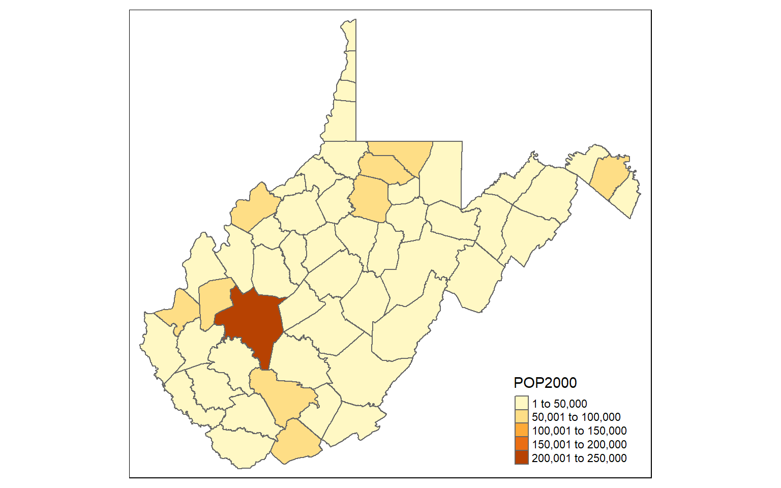
tm_shape(wv_cont)+
    tm_polygons(col="tan")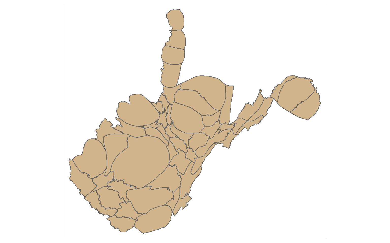
tm_shape(wv_ncont)+
    tm_polygons(col="tan")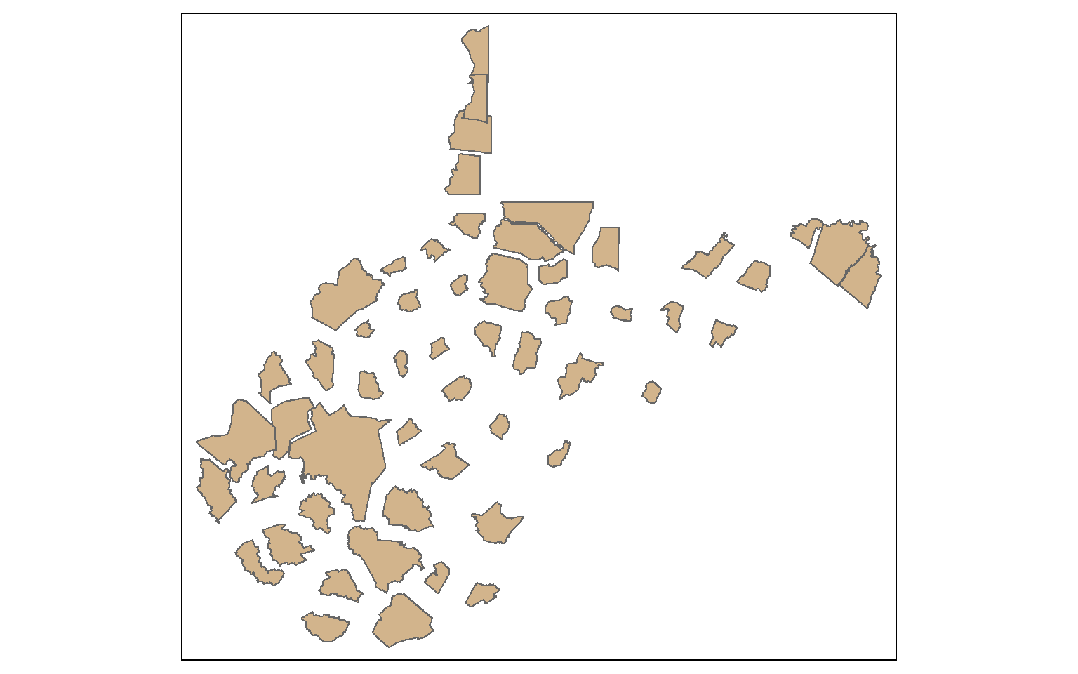
Concluding Remarks
As mentioned above, I prefer tmap as opposed to mapsf for making map layouts in R. tmap provides a lot of symbology and customization options. It also is fairly intuitive and works similarlu to ggplot2. However, mapsf does allow for the production of a wide range of thematic maps, so it is worth exploring. I also encourage you to further explore the eurostate package, as it provides a lot of great data for Europe over different time periods and geographic aggregating units.
Cheat sheets for eurostat and mapsf can be found here. The documentation for mapsf can be found here.
We are now ready to move on and discuss interactive mapping with Leaflet.