Graphs with ggplot2: Part II
Objectives
In the last section we explored the basics of ggplot2 with a focus on syntax and defining aesthetic mappings. In this section, I will demonstrate methods to improve ggplot2 output including:
- Providing titles and text
- Choosing colors
- Editing scale range, markings, and labels
- Defining labels
- Manipulating the legend
- Using facets
- Combining multiple plots into one layout
We will also explore exporting figures as raster and vector graphics.
Overview
I will present multiple graphs and describe the methods used to obtain the output. The link at the bottom of the page provides the example data and R Markdown file used to generate this module. I would encourage you to experiment with further manipulating and editing these graphs.
Before we begin, you will need to load in packages.The ggthemes package provides additional themes for ggplot2. Note That there are other packages that offer even more themes. The cowplot package allows for combining multiple plots to a single layout.
library(ggplot2)
library(ggthemes)
library(cowplot)
Themes
Let’s explore some available themes by applying them to one of the box plots created in the last section. Here is the original plot with the default ggplot2 theme. The goal of this plot is to compare the mean elevation by county for different states in the high plains region of the United States.
library(forcats)
hp_data <- read.csv("ggplot2_p2/high_plains_data.csv", sep=",", header = TRUE, stringsAsFactors=TRUE)
ggplot(hp_data, aes(x=fct_reorder(STATE_NAME, elev, .fun= median, .desc=TRUE), y=elev, fill=STATE_NAME))+
geom_boxplot()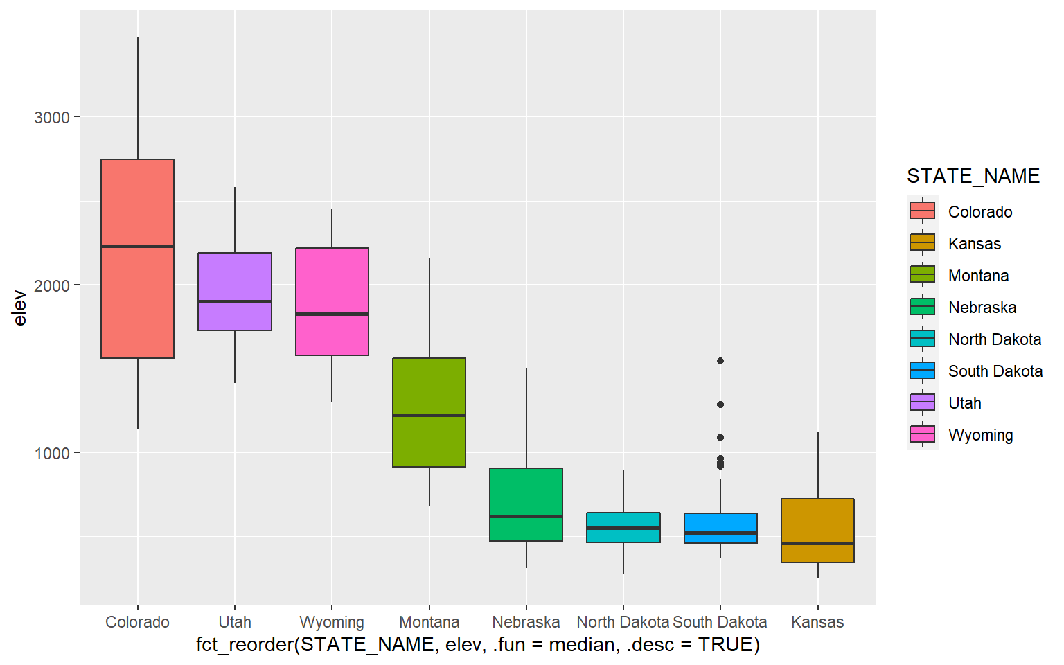
Now, I will apply some themes from ggthemes.
ggplot(hp_data, aes(x=fct_reorder(STATE_NAME, elev, .fun= median, .desc=TRUE), y=elev, fill=STATE_NAME))+
geom_boxplot()+
theme_economist()+
ggtitle("Economist Theme")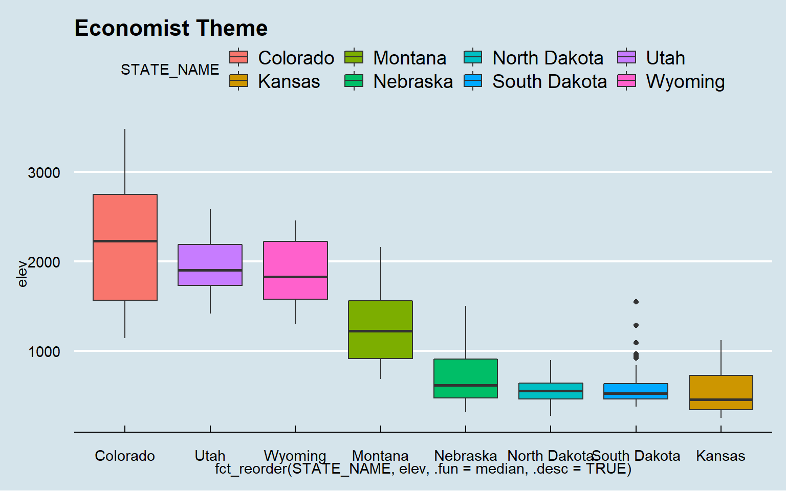
ggplot(hp_data, aes(x=fct_reorder(STATE_NAME, elev, .fun= median, .desc=TRUE), y=elev, fill=STATE_NAME))+
geom_boxplot()+
theme_solarized()+
ggtitle("Solarized Theme")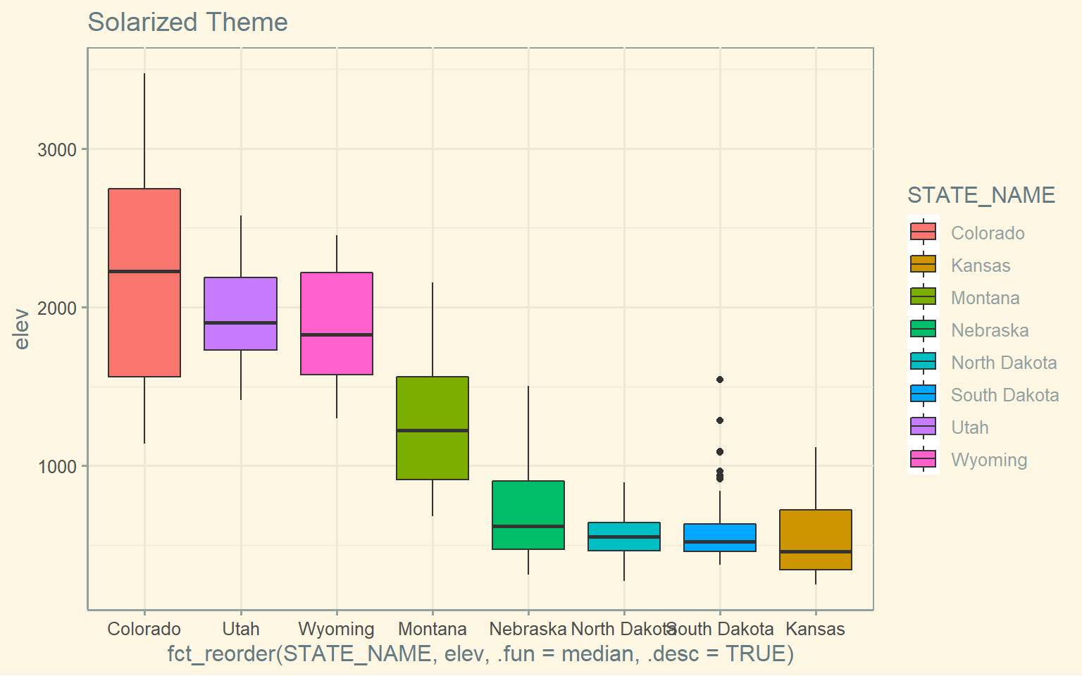
ggplot(hp_data, aes(x=fct_reorder(STATE_NAME, elev, .fun= median, .desc=TRUE), y=elev, fill=STATE_NAME))+
geom_boxplot()+
theme_gdocs()+
ggtitle("Google Docs Theme")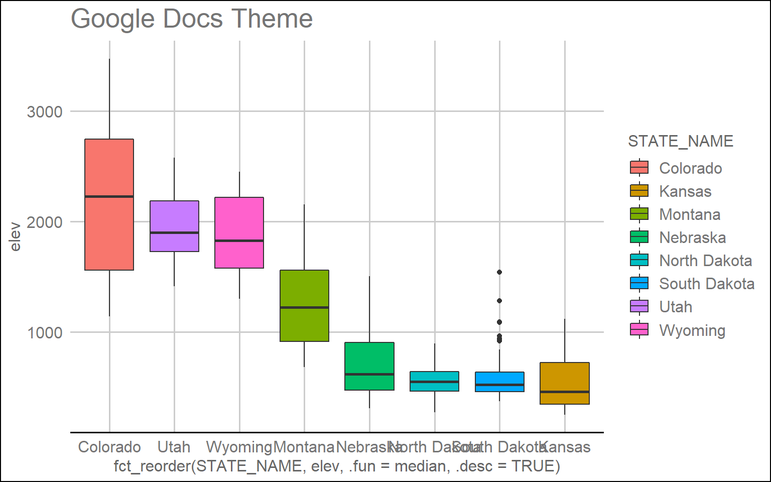
ggplot(hp_data, aes(x=fct_reorder(STATE_NAME, elev, .fun= median, .desc=TRUE), y=elev, fill=STATE_NAME))+
geom_boxplot()+
theme_excel()+
ggtitle("Excel Theme")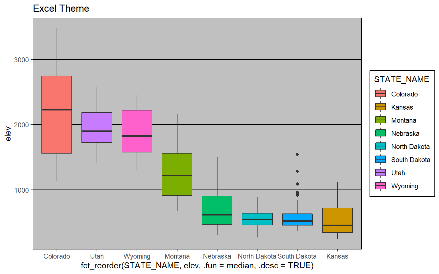
Other than the themes provided in additional packages, ggplot2 provides some native themes. Here are a few examples.
ggplot(hp_data, aes(x=fct_reorder(STATE_NAME, elev, .fun= median, .desc=TRUE), y=elev, fill=STATE_NAME))+
geom_boxplot()+
theme_dark()+
ggtitle("Dark Theme")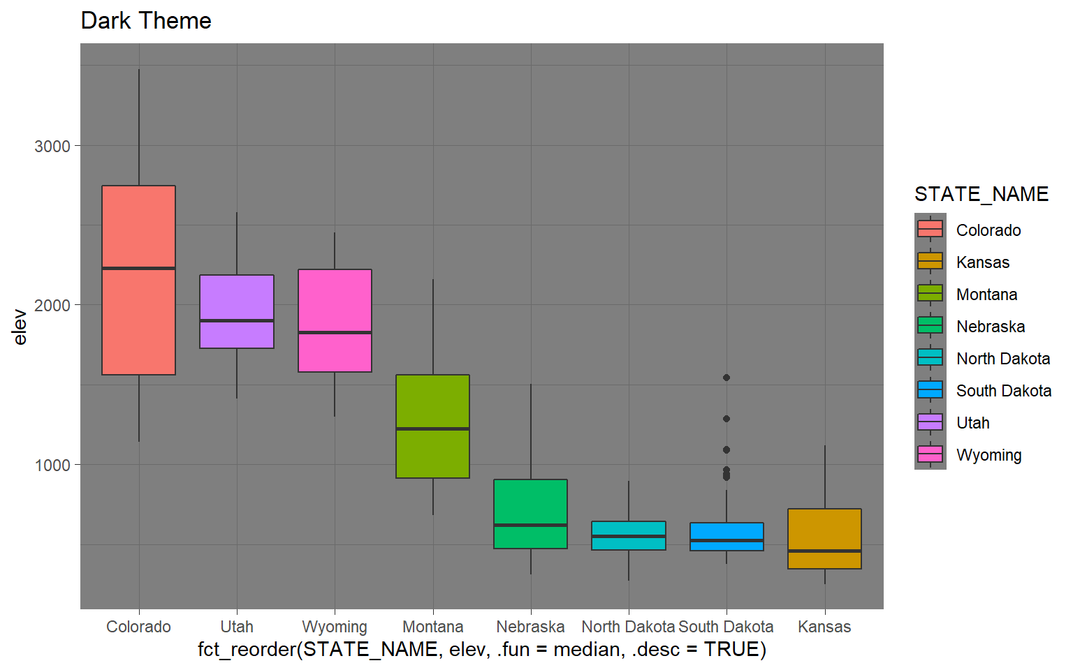
ggplot(hp_data, aes(x=fct_reorder(STATE_NAME, elev, .fun= median, .desc=TRUE), y=elev, fill=STATE_NAME))+
geom_boxplot()+
theme_minimal()+
ggtitle("Minimal Theme")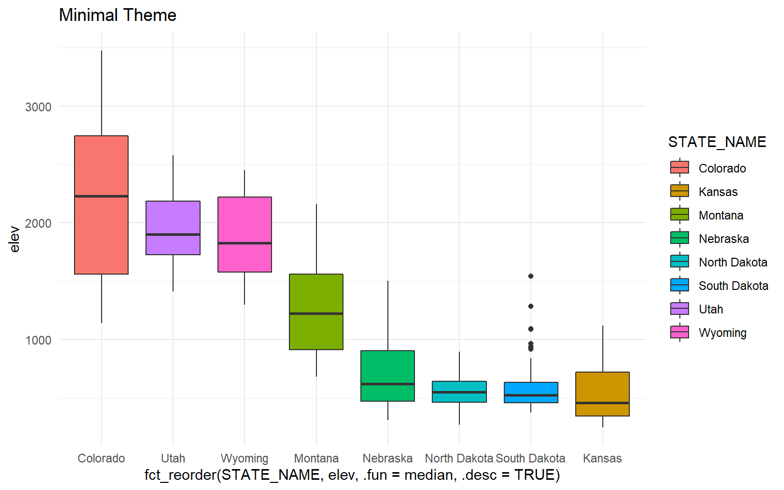
All themes will have default settings to define the presentation. However, the defaults can be overwritten for further customization. Applying these customizations is the primary focus of the majority of this section.
Example 1: Box Plot of County Mean Elevation by State
In this first example, I will step through the process of editing the mean county elevation by state box plot that was created in the last section. I will first present the code then step through the specifics. Here is the code.
ggplot(hp_data, aes(x=fct_reorder(STATE_NAME, elev, .fun= median, .desc=TRUE), y=elev, fill=STATE_NAME))+
geom_boxplot()+
theme_classic()+
ggtitle("Mean County Elevation by State")+
labs(x="State", y="Elevation (feet)", fill="state")+
scale_fill_manual(values = c("#1b9e77", "#d95f02", "#7570b3", "#e7298a", "#66a61e", "#e6a61e", "#e6761d", "#666666"), labels = c("CO", "UT", "WY", "MN", "NE", "ND", "SD", "KS"))+
scale_x_discrete(expand = c(.075, .075), labels = c("CO", "UT", "WY", "MN", "NE", "ND", "SD", "KS"))+
scale_y_continuous(expand = c(0, 0),breaks = c(500,1000, 1500, 2000, 2500, 3000, 3500), limits= c(0, 4000), labels= c("500", "1,000", "1,500", "2,000", "2,500", "3,000", "3,500"))+
theme(axis.text.y = element_text(size=12, color="gray40"))+
theme(axis.text.x = element_text(size=12, color="gray40"))+
theme(plot.title = element_text(face="bold", size=18, color="gray40"))+
theme(axis.title = element_text(size=14, color="gray40"))+
theme(legend.position = "None")+
theme(panel.grid.major.y = element_line(colour = "gray40", linetype="dashed"))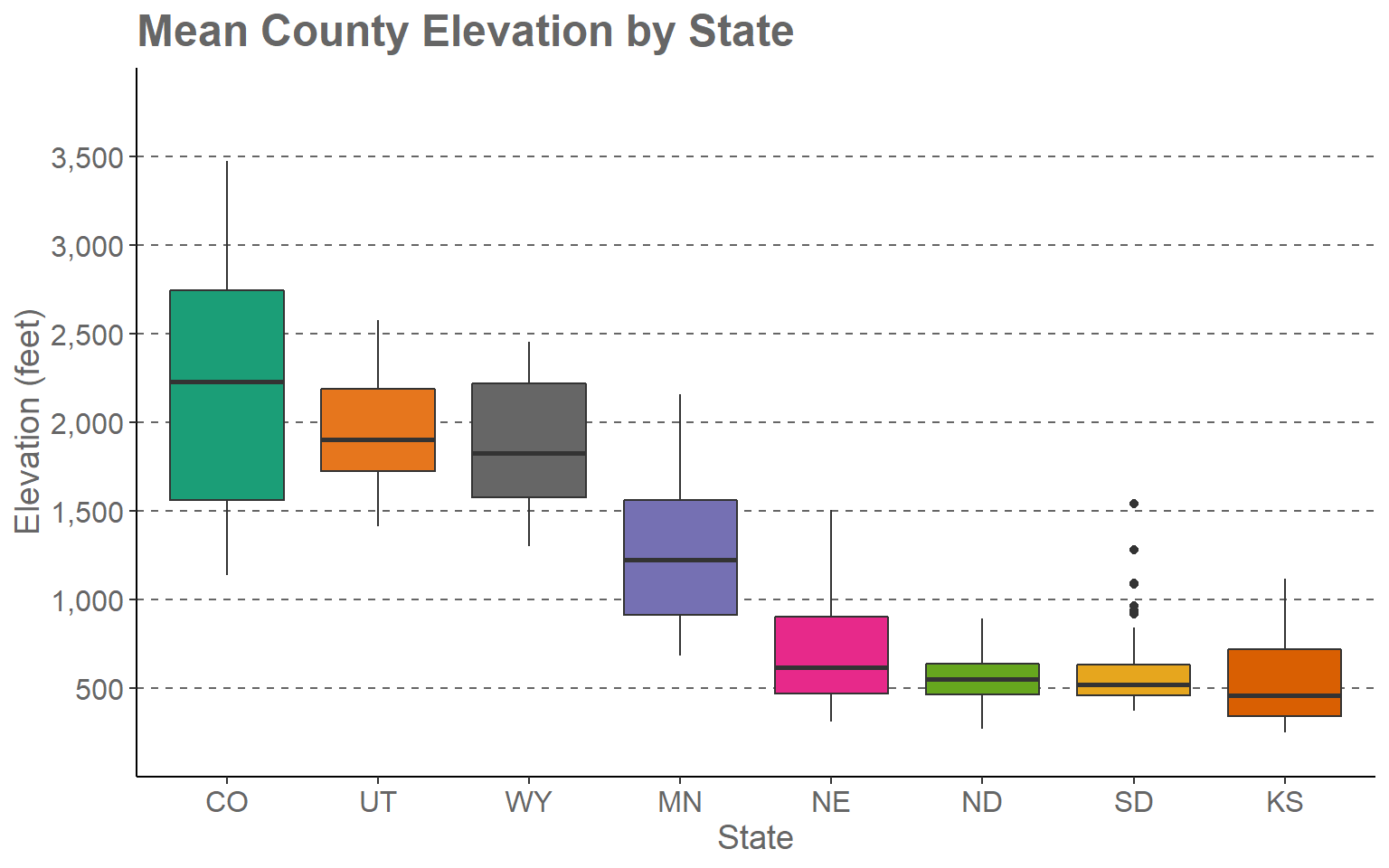
This may seem like a complex set of code. However, once we break it down you will see that it is actually pretty simple and intuitive.
- The first two lines define the original box plot. If I deleted all other lines, I would get the original version that was created in the last section and earlier in this section.
- I am applying a new theme (theme_classic()). Among other changes, this removes the default gray plot background.
- I provide a title using the ggtitle() function.
- I provide axes titles and a title for the fill color using the labs() function.
- I would like to define my own colors to represent each state. This is accomplished using the scale_fill_discrete() function. This is a discrete scale, as opposed to a continuous scale, because a categorical variable is mapped to fill as opposed to a continuous variable. The values argument provides a vector of hex codes to represent different colors in 8-bit RGB color space. In R there are many ways to define colors including hex codes, RGB values (using the rgb() function), and hue, saturation, and value (HSV) (using the hsv() function). Along with indicating colors using RGB or HSV, you can also provide an alpha value for transparency. Unlike most graphic editing software packages, in which RGB values are scaled from 0 to 255 for 8-bit RGB colors, R uses a 0 to 1 scale. There are also named colors in R. Here is a link to a PDF that lists the named colors. The number of colors provided must match the number of categories. The labels parameter allows you to apply a specific label to each category, in this case states. Instead of using the full state name, I have used the state abbreviations. Note that the names and associated colors and labels must be in the same order so that they are correctly associated. In other words, the association is based on the position or index in the vector.
- The state name was mapped to the fill color and the x-axis. So, I need to make similar adjustments for the x aesthetic. Using scale_x_discrete() I apply the same labels to the x-axis as were applied for the fill color. By default, ggplot2 will place a gap between the axes and the graph. This can be removed or altered using the expand argument. I have set this to 0.075 in the right and left directions so that the gap distance is reduced.
- Since a continuous variable is mapped to the y-axis, I use scale_y_continuous() to make adjustments. I am removing the gap between the axis and the graph using expand and a distance of zero in the up and down directions. The breaks argument defines the desired breaks; the limits argument defines the minimum and maximum values to plot on the axis, and the labels argument is used to change the break labels on the axis.
- The remaining lines make manual alterations to the chosen theme, in this case theme_classic(). I am changing the font size to 12-point for the x-axis and y-axis labels and changing the color using a named color (“gray40”). I am bolding the title, changing the size to 18-point, and changing the color. The x-axis and y-axis titles are being changed to 14-point font. I am removing the legend by setting the legend.position argument to “None.” Since the x-axis explains the colors, I don’t need a legend. Lastly, I am adding in gray grid lines with a dashed pattern for the major y-axis divisions. I could have included all of the theme changes in a single theme() call. However, I find that it is easier to read when broken into separate components.
I encourage you to experiment with this example by making alterations, adding additional modifications, and/or commenting out lines. The best way to learn ggplot2 is to experiment. Remember to include a + at the end of each component to string them together. This site provides a great reference for ggplot2. Once you feel comfortable with this, try applying these methods to your own data.
Example 2: Maple Leaf Spectral Reflectance Curve
In the last section, we generated a spectral reflectance graph for a maple leaf using the code provided below.
setwd("D:/ossa/ggplot2_p2")
leaf <- read.csv("maple_leaf.csv", header=TRUE, sep=",")
ggplot(leaf, aes(x=wav, y=reflec))+
geom_line()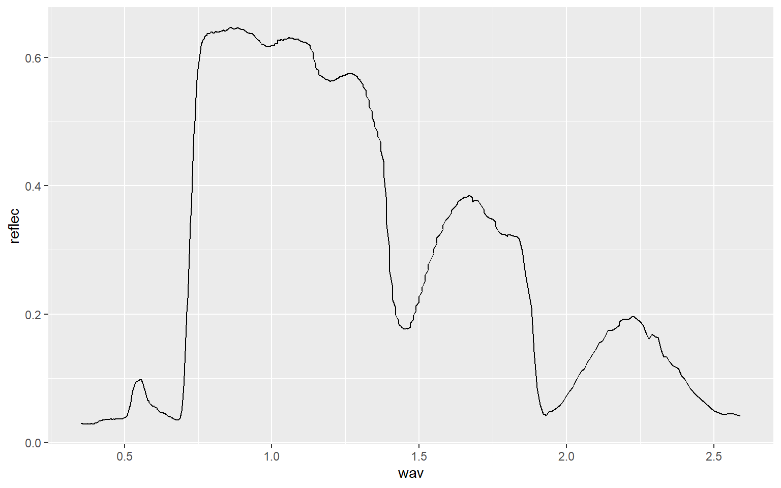
I have made additional modifications to improve the figure in the code block below.
region <- c("Blue", "Green", "Red", "NIR", "SWIR")
x1<- c(400, 500, 600, 700, 1300)
x2 <- c(500, 600, 700, 1300, 2600)
y1 <- c(0, 0, 0, 0, 0)
y2 <- c(70, 70, 70, 70, 70)
spec_reg <- data.frame(region, x1, x2, y1, y2)
spec_reg$region <- factor(spec_reg$region, order=TRUE, levels=c("Blue","Green", "Red", "NIR", "SWIR"))

ggplot()+
geom_rect(spec_reg, mapping=aes(xmin=x1, xmax=x2, ymin=y1, ymax=y2, fill=region), alpha=0.5)+
geom_line(leaf, mapping=aes(x=wav*1000, y=reflec*100), color=rgb(1, 0, 0), size=1.2)+
ggtitle("Maple Leaf Spectral Reflectance")+
labs(x="Wavelength (nm)", y="% Reflectance", fill="Region")+
scale_fill_manual(values = c("#0000FF", "#00FF00", "#FF0000", "#E35604", "#FFBE89"), labels = c("Green", "Blue", "Red", "NIR", "SWIR"))+
theme_classic()+
scale_x_continuous(expand = c(0, 0), limits=c(400, 2600), breaks=c(400, 500,600, 700, 1000, 1300, 1500, 2000, 2500), labels =c("400 nm", "500 nm", "600 nm", "700 nm", "1,000 nm", "1,300 nm", "1,500 nm", "2,000 nm", "2,500 nm"))+
scale_y_continuous(expand = c(0, 0), limits=c(0, 70), breaks= c(10,20, 30, 40, 50, 60, 70), labels= c("10%", "20%", "30%", "40%", "50%", "60%", "70%"))+
theme(axis.text.x = element_text(angle = 45, hjust=1))+
theme(axis.text = element_text(colour = "gray40", face="italic"))+
theme(plot.title = element_text(face="bold", size=16))+
theme(axis.title = element_text(size=14))+
theme(legend.position = c(.9, .7), legend.background = element_rect(fill="gray87", size=0.5, linetype="solid", colour ="gray28"), legend.title= element_blank())+
theme(panel.grid.major.y = element_line(colour = "gray40", linetype="dashed"))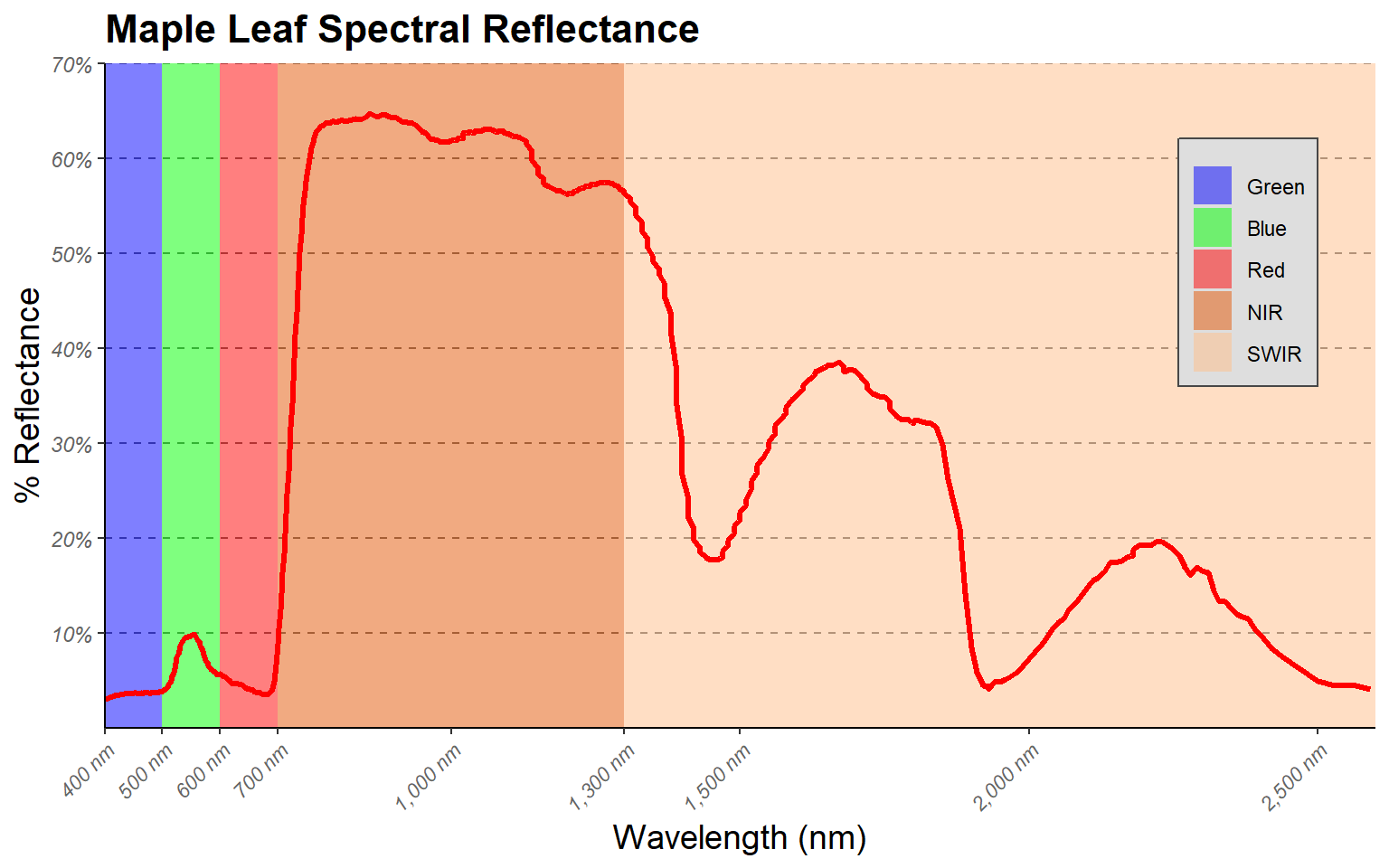
Here are some explanations of the modifications.
- I want to highlight the different spectral regions in the graph. To do so, I first create a data frame that provided the x- and y-extents of each range along with a label. I then used this data frame and geom_rect() to define rectangular extents in the graph space that correspond to each spectral range. I apply a transparency of 50% using the alpha argument so that the graph can be viewed beneath the rectangles. I also place the added geom_rect() function before the geom_line() function that defines the spectral curve so that the curve is placed above the rectangles in the graph space.
- Instead of using the default colors assigned to the spectral regions, I want to define my own colors and labels. This is accomplished using a scale_fill_manual() function, hex codes to define colors, and a list of labels. Note again that the order must be the same so that categories, colors, and labels match up.
- A title and axes labels are added using ggtitle() and labs().
- Using scale_x_continuous() and scale_y_continuous(), I define my own breaks, labels, and extent for each axis. I also remove the gap between the graph and the axes using the expand argument.
- I start with theme_classic() then make modifications using theme(). Based on the first example, you should be able to understand how changes to font face, size, and color are applied. Due to crowding issues, I rotate the x-axis labels using an angle argument. I then adjusted their horizontal positions using hjust. For the legend, I place it in the graph space using x and y position arguments. The bottom-left corner is assigned a value of (0,0) while the top-right is assigned a value of (1,1). I have placed the legend at (0.9, 0.7) so that it does not overlap with the spectral curve. I also make the background gray and the border black. Since a legend title is unnecessary, it is removed using legend.title= element_blank(). Lastly, I edit the major y-axis lines using the same method that was applied in the first example.
Example 3: Wetland Mapping Comparison
This example is taken from one of my research projects. The work is published here:
Maxwell, A.E., and T.A. Warner, 2019. Is high spatial resolution DEM data necessary for mapping palustrine wetlands?, International Journal of Remote Sensing, 40(1): 118-137. https://doi.org/10.1080/01431161.2018.1506184.
In this figure, our goal is to compare different digital elevation data sources and spatial resolutions for predicting where palustrine emergent (PEM) and palustrine forested/scrub-shrub (PFO/PSS) wetlands might occur on the landscape based on terrain characteristics. In this figure specifically, we are assessing how the number of training samples provided impacts the model performance, as measured using the area under the receiver operating characteristic (ROC) curve (AUC) measure. The data provided are the data used in the paper.
This figure makes use of faceting in which one or two categorical variables are used to break the data up into separate graphs presented as rows and columns. In this example specifically, I am using the two wetland types mapped to define the columns and the study areas, of which there are two, to define the rows. So, a separate graph is generated for each wetland type-study area combination. Faceting can be useful for making comparisons or dealing with overplotting or crowding. Note that the same variables are mapped to the axes in all graphs and the same scales are used.
Before we can generate the graph, the raw data must be manipulated using the melt() function from the reshape() package. This function is used to generate a unique record for each source data, study site, and wetland type combination. I then recode the site names and change the level names so that they are more descriptive for use in the figure.
library(reshape)data <- read.csv("ggplot2_p2/line_range_data.csv")
data2 <- melt(data, id=c("DEM.Data", "Site", "Type"))
data2$Site[data2$Site == 1] <- "Site 1"
data2$Site[data2$Site == 2] <- "Site 2"
levels(data2$variable) <- c("LiDAR (1m)", "LiDAR (3m)", "LiDAR (10m)", "SAMB (3m)", "SAMB (10m)", "NED (10m)")
ggplot(data2, aes(color=variable))+
geom_line(aes(x=DEM.Data, y=value))+
geom_point(aes(x=DEM.Data, y=value),size=2)+
facet_grid(Site ~ Type)+
scale_x_continuous(breaks = c(100, 500, 1000, 2000, 3000), limits= c(100,3000),
label = c("100", "500", "1,000", "2,000", "3,000"))+
theme_bw()+
ggtitle("Impact of Sample Size")+
labs(x="Number of Samples", y="AUC", color="Data Input")+
scale_color_manual(values = c("#7fc97f", "#beaed4", "#fdc086", "#ffff99", "#386cb0", "#f0027f"))+
theme(axis.text.y = element_text(size=12, color="gray40"))+
theme(axis.text.x = element_text(size=12, angle=45, hjust=1, color="gray40"))+
theme(plot.title = element_text(face="bold", size=18, color="red"))+
theme(axis.title = element_text(size=14, color="red"))+
theme(strip.text = element_text(size = 14, colour = "red"))+
theme(legend.title = element_text(colour="blue", size=14, face="bold", color="red"))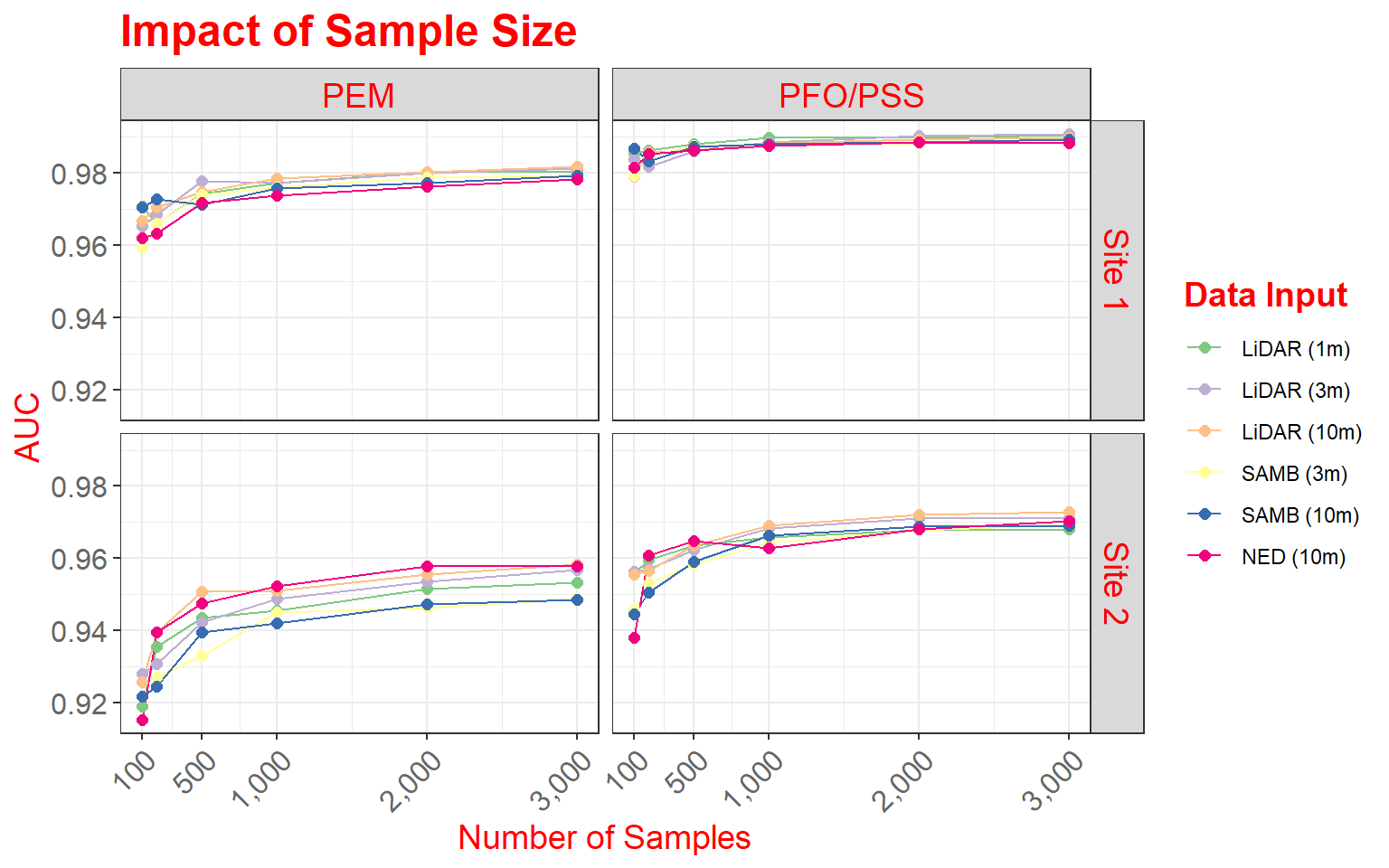
Here are some specifics related to this plot.
- Two geoms (geom_line() and geom_point()) are used to produce both line and point symbols. So, this is a combination scatter plot and line graph.
- facet_grid() is used to define the faceting scheme. I use categorical variables to define the desired rows and columns. The first argument specifies the rows while the second defines the columns. You can leave one position blank if you only want to map to rows or columns (for example, . ~ Cat1 or Cat1 ~ .).
- Similar to the examples above, I use scale_x_continuous() to define breaks, limits, and labels for the x-axis. Here, I retain the default for the y-axis, as I felt it was appropriate.
- I use scale_color_manual() to define colors to represent each data source and resolution combination. Colors are defined using hex codes. I did not provide labels because I feel that the provided category names are fine.
- A title and axes labels are added using ggtitle() and labs().
- I start with theme_bw().
- I alter the defaults by providing multiple theme() arguments as demonstrated above.
As a side note, here are versions of the graph using only rows or columns. In the first example, I am separating out only the data from Site 1, and in the second graph I am extracting out only PEM wetlands.
data_site1 <- data2 %>% dplyr::filter(Site=="Site 1")

ggplot(data_site1, aes(color=variable))+
geom_line(aes(x=DEM.Data, y=value))+
geom_point(aes(x=DEM.Data, y=value),size=2)+
facet_grid(. ~ Type)+
scale_x_continuous(breaks = c(100, 500, 1000, 2000, 3000), limits= c(100,3000),
label = c("100", "500", "1,000", "2,000", "3,000"))+
theme_bw()+
ggtitle("Impact of Sample Size")+
labs(x="Number of Samples", y="AUC", color="Data Input")+
scale_color_manual(values = c("#7fc97f", "#beaed4", "#fdc086", "#ffff99", "#386cb0", "#f0027f"))+
theme(axis.text.y = element_text(size=12, color="gray40"))+
theme(axis.text.x = element_text(size=12, angle=45, hjust=1, color="gray40"))+
theme(plot.title = element_text(face="bold", size=18, color="red"))+
theme(axis.title = element_text(size=14, color="red"))+
theme(strip.text = element_text(size = 14, colour = "red"))+
theme(legend.title = element_text(colour="blue", size=14, face="bold", color="red"))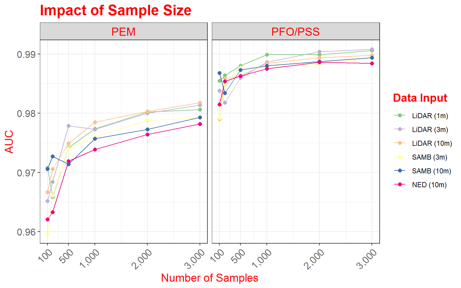
data_pem <- data2 %>% dplyr::filter(Type=="PEM")

ggplot(data_pem, aes(color=variable))+
geom_line(aes(x=DEM.Data, y=value))+
geom_point(aes(x=DEM.Data, y=value),size=2)+
facet_grid(Site ~ .)+
scale_x_continuous(breaks = c(100, 500, 1000, 2000, 3000), limits= c(100,3000),
label = c("100", "500", "1,000", "2,000", "3,000"))+
theme_bw()+
ggtitle("Impact of Sample Size")+
labs(x="Number of Samples", y="AUC", color="Data Input")+
scale_color_manual(values = c("#7fc97f", "#beaed4", "#fdc086", "#ffff99", "#386cb0", "#f0027f"))+
theme(axis.text.y = element_text(size=12, color="gray40"))+
theme(axis.text.x = element_text(size=12, angle=45, hjust=1, color="gray40"))+
theme(plot.title = element_text(face="bold", size=18, color="red"))+
theme(axis.title = element_text(size=14, color="red"))+
theme(strip.text = element_text(size = 14, colour = "red"))+
theme(legend.title = element_text(colour="blue", size=14, face="bold", color="red"))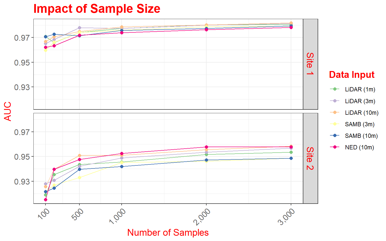
Example 4: Sample Size for Land Cover Classification
In this final example, we will explore another means to combine multiple plots into a single layout. This example is from the following paper:
Maxwell, A.E., M.P. Strager, T.A. Warner, C.A. Ramezan, A.N. Morgan, and C.E. Pauley, 2019. Large-area, high spatial resolution land cover mapping using random forests, GEOBIA, and NAIP orthophotography: findings and recommendations, Remote Sensing, 11(12) 1409 1-27. https://doi.org/10.3390/rs11121409.
This figure summarizes how reducing training sample size impacts overall accuracy, the Kappa statistic, allocation disagreement, quantity disagreement, and class user’s and producer’s accuracies. Since these graphs do not share common axes, it is not possible to use faceting. Instead, I make separate graphs then combine them into the same layout space. To do this, I use the plot_grid() function from the cowplot package.
First, I apply some data pre-processing using dplyr to get the data into the correct shape. Next, I create four separate graphs and save them to variables. The graphs must be saved to variables since I will need to call them within the plot_grid() function.
library(cowplot)
library(dplyr)
metrics <- read.csv("ggplot2_p2/acc_assessment.csv", header=TRUE, sep=",")
summarize_mn <- metrics %>% group_by(TrainSet) %>% summarise(Overall =mean(Overall), Kappa =mean(Kappa),
UBarren = mean(UBarren), UForest = mean(UForest), UGrass = mean(UGrass), UImperv = mean(UImperv), UDev = mean(UDev), UWater = mean(UWater),
PBarren = mean(PBarren), PForest = mean(PForest), PGrass = mean(PGrass), PImperv = mean(PImperv), PDev = mean(PDev), PWater = mean(PWater),
Allocation = mean(Allocation), Quantity = mean(Quantity), size = mean(size))
summarize_sd <- metrics %>% group_by(TrainSet) %>% summarise(Overallsd =sd(Overall), Kappasd =sd(Kappa), UBarrensd = sd(UBarren), UForestsd = sd(UForest), UGrasssd = sd(UGrass), UImpervsd = sd(UImperv), UDevsd = sd(UDev), UWatersd = sd(UWater),
PBarrensd = sd(PBarren), PForestsd = sd(PForest), PGrasssd = sd(PGrass), PImpervsd = sd(PImperv), PDevsd = sd(PDev), PWatersd = sd(PWater),
Allocationsd = sd(Allocation), Quantitysd = sd(Quantity))
all_sum <- cbind(summarize_mn, summarize_sd)
names(all_sum)[1] <- "TS2"
acc <- ggplot(all_sum, aes(x=size, y=Overall))+
geom_point(aes(color="black"), size=3)+
geom_line(aes(color="black"))+
geom_errorbar(aes(ymin=Overall-Overallsd, ymax=Overall+Overallsd), width=20)+
geom_point(aes(x=size, y=(Kappa*100), color="gray"))+
geom_line(aes(x=size, y=(Kappa*100), color="gray"))+
geom_errorbar(aes(ymin=(Kappa-Kappasd)*100, ymax=(Kappa+Kappasd)*100), width=20, color="gray")+
theme_classic()+
scale_color_identity(name = "Measures",
breaks = c("black", "gray"),
labels = c("Overall Accuracy", "Kappa"),
guide = "legend")+
scale_x_continuous(breaks = c(10, 100, 250, 500, 750, 1000), limits= c(0,1010),
label = c("10", "100", "250", "500", "750", "1,000"))+
labs(x="Sample Size", y="Overall Accuracy (%)")+
scale_y_continuous(breaks = c(75, 80, 85, 90, 95, 100), labels = c("75%", "80%", "85%", "90%", "95%", "100%"), limits = c(75, 100), sec.axis = sec_axis(~.*.01, name = "Kappa"))+
theme(plot.title = element_blank())
disagreement <- ggplot(all_sum, aes(x=size, y=Allocation))+
geom_point(aes(color="black"), size=3)+
geom_line(aes(color="black"))+
geom_errorbar(aes(ymin=Allocation-Allocationsd, ymax=Allocation+Allocationsd), width=20)+
geom_point(aes(x=size, y=(Quantity), color= "gray"))+
geom_line(aes(x=size, y=(Quantity), color = "gray"))+
geom_errorbar(aes(ymin=Quantity-Quantitysd, ymax=Quantity+Quantitysd), width=20, color="gray")+
theme_classic()+
scale_color_identity(name = "Measures",
breaks = c("black", "gray"),
labels = c("Allocation Disagreement", "Quantity Disagreement"),
guide = "legend")+
scale_x_continuous(breaks = c(10, 100, 250, 500, 750, 1000), limits= c(0,1010),
label = c("10", "100", "250", "500", "750", "1,000"))+
labs(x="Sample Size", y="Disagreement")+
theme(plot.title = element_blank())
users <- ggplot(all_sum, aes(x=size, y=UBarren))+
geom_point(aes(color="gray"))+
geom_line(aes(color="gray"))+
geom_errorbar(aes(ymin=UBarren-UBarrensd, ymax=UBarren+UBarrensd), width=20, color="gray")+
geom_point(aes(x=size, y=(UForest), color= "green"))+
geom_line(aes(x=size, y=(UForest), color = "green"))+
geom_errorbar(aes(ymin=UForest-UForestsd, ymax=UForest+UForestsd), width=20, color="green")+
geom_point(aes(x=size, y=(UGrass), color="yellow"))+
geom_line(aes(x=size, y=(UGrass), color="yellow"))+
geom_errorbar(aes(ymin=UGrass-UGrasssd, ymax=UGrass+UGrasssd), width=20, color="yellow")+
geom_point(aes(x=size, y=(UImperv), color="red"))+
geom_line(aes(x=size, y=(UImperv), color="red"))+
geom_errorbar(aes(ymin=UImperv-UImpervsd, ymax=UImperv+UImpervsd), width=20, color="red")+
geom_point(aes(x=size, y=(UDev), color="salmon"))+
geom_line(aes(x=size, y=(UDev), color="salmon"))+
geom_errorbar(aes(ymin=UDev-UDevsd, ymax=UDev+UDevsd), width=20, color="salmon")+
geom_point(aes(x=size, y=(UWater), color="blue"))+
geom_line(aes(x=size, y=(UWater), color="blue"))+
geom_errorbar(aes(ymin=UWater-UWatersd, ymax=UWater+UWatersd), width=20, color="blue")+
theme_classic()+
scale_color_identity(name = "Measures",
breaks = c("gray", "green", "yellow", "red", "salmon", "blue"),
labels = c("Barren", "Forest", "Low Vegetation", "Impervious", "Mixed Developed", "Water"),
guide = "legend")+
scale_x_continuous(breaks = c(10, 100, 250, 500, 750, 1000), limits= c(0,1010),
label = c("10", "100", "250", "500", "750", "1,000"))+
labs(x="Sample Size", y="Users's Accuracy")+
theme(plot.title = element_blank())
producers <- ggplot(all_sum, aes(x=size, y=PBarren))+
geom_point(aes(color="gray"))+
geom_line(aes(color="gray"))+
geom_errorbar(aes(ymin=PBarren-PBarrensd, ymax=PBarren+PBarrensd), width=20, color="gray")+
geom_point(aes(x=size, y=(PForest), color= "green"))+
geom_line(aes(x=size, y=(PForest), color = "green"))+
geom_errorbar(aes(ymin=PForest-PForestsd, ymax=PForest+PForestsd), width=20, color="green")+
geom_point(aes(x=size, y=(PGrass), color="yellow"))+
geom_line(aes(x=size, y=(PGrass), color="yellow"))+
geom_errorbar(aes(ymin=PGrass-PGrasssd, ymax=PGrass+PGrasssd), width=20, color="yellow")+
geom_point(aes(x=size, y=(PImperv), color="red"))+
geom_line(aes(x=size, y=(PImperv), color="red"))+
geom_errorbar(aes(ymin=PImperv-PImpervsd, ymax=PImperv+PImpervsd), width=20, color="red")+
geom_point(aes(x=size, y=(PDev), color="salmon"))+
geom_line(aes(x=size, y=(PDev), color="salmon"))+
geom_errorbar(aes(ymin=PDev-PDevsd, ymax=PDev+PDevsd), width=20, color="salmon")+
geom_point(aes(x=size, y=(PWater), color="blue"))+
geom_line(aes(x=size, y=(PWater), color="blue"))+
geom_errorbar(aes(ymin=PWater-PWatersd, ymax=PWater+PWatersd), width=20, color="blue")+
theme_classic()+
scale_color_identity(name = "Measures",
breaks = c("gray", "green", "yellow", "red", "salmon", "blue"),
labels = c("Barren", "Forest", "Low Vegetation", "Impervious", "Mixed Developed", "Water"),
guide = "legend")+
scale_x_continuous(breaks = c(10, 100, 250, 500, 750, 1000), limits= c(0,1010),
label = c("10", "100", "250", "500", "750", "1,000"))+
labs(x="Sample Size", y="Producer's Accuracy")+
theme(plot.title = element_blank())
plot_grid(acc, disagreement, users, producers, nrow= 2, align="v")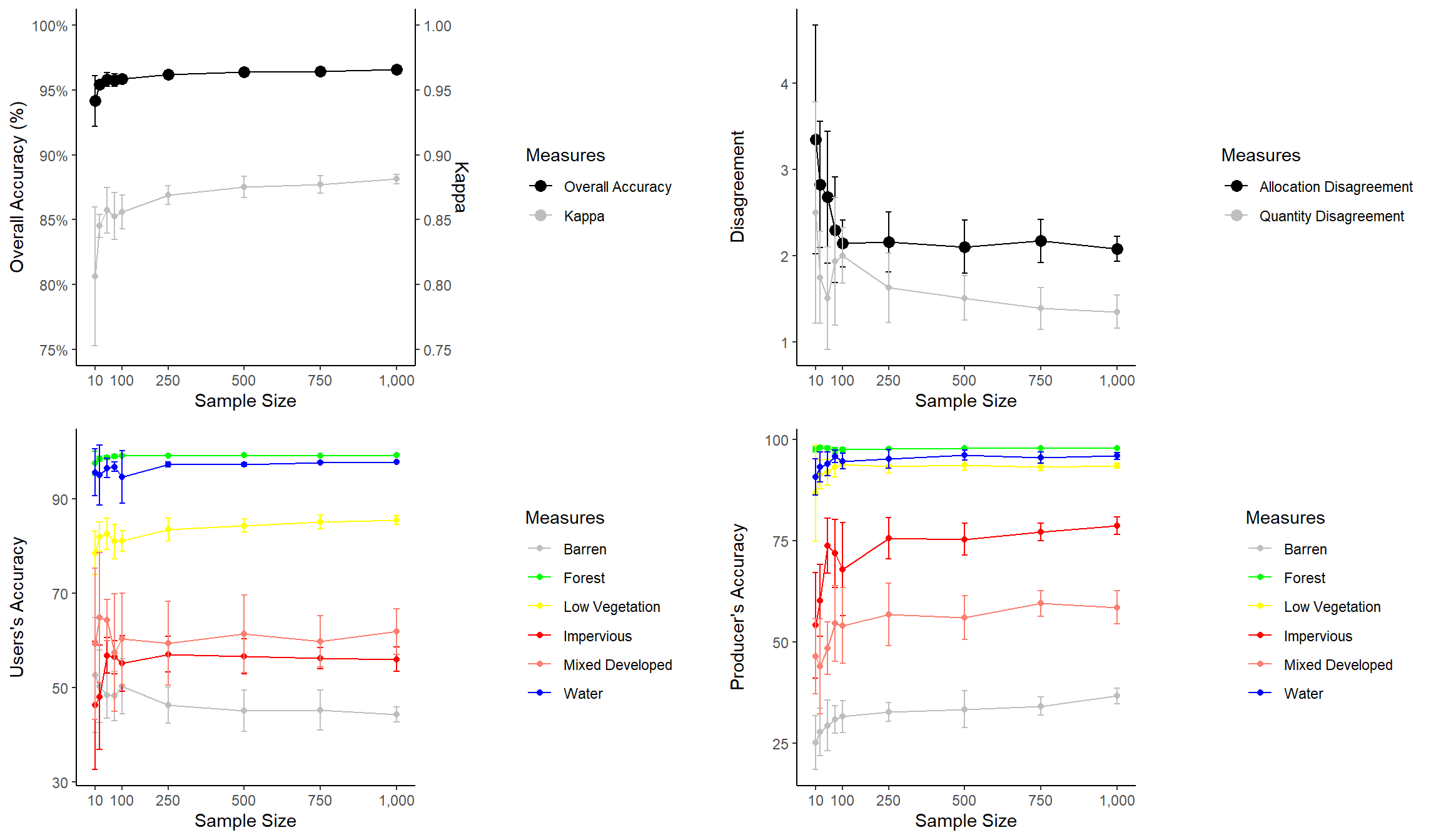
Here are few comments about the graphs before we discuss combining them.
- I use a new geom here to create error bars (geom_errorbars()). The error bar range is defined by adding and subtracting the standard deviation from the mean value.
- I am using scale_color_identity() so that I can add the colors to the legend. This allows for a color or other graphical assignment to be treated as a variable.
- I am using theme_classic() and making modifications using theme(), as you’ve seen in many examples above.
- In the first graph, I am adding a second y-axis scale for Kappa using arguments within scale_y_continuous().
The last piece of code above uses plot_grid() from the cowplot package to place the figures into the same layout space and requires a list of plots, a desired number of rows, and whether to arrange vertically or horizontally. You can also leave empty space and add labels, as shown in the example below. This last example still needs some work. My goal here is just to demonstrate leaving gaps and providing labels.
plot_grid(acc, NULL, NULL, disagreement, users, NULL, NULL, producers, nrow= 4, labels = c("A", "B", "C", "D", "E", "F", "G", "H"))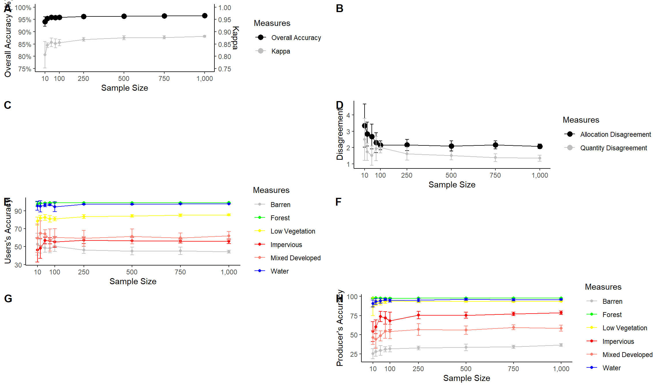
Saving to Disk
In this last section, we will discuss saving your figures to disk as permanent files. First, I recreate the spectral reflectance graph and save it as an object so that it can be called in a function.
region <- c("Blue", "Green", "Red", "NIR", "SWIR")
x1<- c(400, 500, 600, 700, 1300)
x2 <- c(500, 600, 700, 1300, 2600)
y1 <- c(0, 0, 0, 0, 0)
y2 <- c(70, 70, 70, 70, 70)
spec_reg <- data.frame(region, x1, x2, y1, y2)
spec_reg$region <- factor(spec_reg$region, order=TRUE, levels=c("Blue","Green", "Red", "NIR", "SWIR"))

leaf_spec_crv <- ggplot()+
geom_rect(spec_reg, mapping=aes(xmin=x1, xmax=x2, ymin=y1, ymax=y2, fill=region), alpha=0.5)+
geom_line(leaf, mapping=aes(x=wav*1000, y=reflec*100), color=rgb(1, 0, 0), size=1.2)+
ggtitle("Maple Leaf Spectral Reflectance")+
labs(x="Wavelength (nm)", y="% Reflectance", fill="Region")+
scale_fill_manual(values = c("#0000FF", "#00FF00", "#FF0000", "#E35604", "#FFBE89"), labels = c("Green", "Blue", "Red", "NIR", "SWIR"))+
theme_classic()+
scale_x_continuous(expand = c(0, 0), limits=c(400, 2600), breaks=c(400, 500,600, 700, 1000, 1300, 1500, 2000, 2500), labels =c("400 nm", "500 nm", "600 nm", "700 nm", "1,000 nm", "1,300 nm", "1,500 nm", "2,000 nm", "2,500 nm"))+
scale_y_continuous(expand = c(0, 0), limits=c(0, 70), breaks= c(10,20, 30, 40, 50, 60, 70), labels= c("10%", "20%", "30%", "40%", "50%", "60%", "70%"))+
theme(axis.text.x = element_text(angle = 45, hjust=1))+
theme(axis.text = element_text(colour = "gray40", face="italic"))+
theme(plot.title = element_text(face="bold", size=16))+
theme(axis.title = element_text(size=14))+
theme(legend.position = c(.9, .7), legend.background = element_rect(fill="gray87", size=0.5, linetype="solid", colour ="gray28"), legend.title= element_blank())+
theme(panel.grid.major.y = element_line(colour = "gray40", linetype="dashed"))
Once the figure is saved to an object, I use ggsave() to export it out to a file. I also provide dimensions and a DPI.
In the first example, I am saving the file to a raster image in TIFF format. Note that if you do not specify a path then the graph will save to the current working directory. If you do not want to save this file to your machine, don’t run this example.
ggsave(filename="D:/ossa/leaf_spec_crrv.tiff", leaf_spec_crv, width=10, height=8, units="in", dpi=300)If you want to save the file to a compressed raster format, you could use either the JPEG or PNG format.
ggsave(filename="D:/ossa/leaf_spec_crrv.png", leaf_spec_crv, width=10, height=8, units="in", dpi=300)If you would like to do additional editing in a vector graphics editing software, such as Inkscape or Adobe Illustrator, you should save to PDF or a vector format such as EPS or SVG.
ggsave(filename="D:/ossa/leaf_spec_crrv.pdf", leaf_spec_crv, width=10, height=8, units="in", dpi=300)ggsave(filename="D:/ossa/leaf_spec_crrv.svg", leaf_spec_crv, width=10, height=8, units="in", dpi=300)Concluding Remarks
I feel like we have covered a lot of ground in the last two sections. You should now have experience creating and refining a variety of graph types. In this last section, I have tried to focus on design techniques that I commonly use. If you start to use ggplot2 for your own data visualization, you will likely run into specific issues not covered here. Fortunately, there is a large ggplot2 user community. I rarely find an issue that I can’t resolve with a Google search. If you find that accomplishing something very specific is difficult or impossible, you can always export to a vector graphic file and perform additional editing outside of R. For example, I have generally found working with specific fonts to be difficult in R, so I commonly will make font changes in post production. Inkscape is a very powerful vector graphic editing software tool that is free and open-source.
Again, the best way to learn ggplot2 is to practice, so I encourage you to explore other data sets or your own data using this tool. We will return to discussing data visualization in a later section in the context of map design. However, we need to discuss reading in and working with spatial data in R first.